Case Studies

Project Chick

 Brand Identity & Photography


Dr. Brittny James came to us with an idea and a whole lot of vision for Project Chick Stationary and we loved the challenge! Through brand strategy sessions, we worked closely with her to shape that idea into something real. The visual identity for the cool, innovative, project based planner was born. From there, we executed two Brand Lifestyle shoots, highlighting the products and putting Dr. James herself front and center as the face of the brand.

The result was an identity that resonated with her target market. Customers loved the clean, no-fluff aesthetic. the combination of intentional logo design and compelling lifestyle photography gave the brand a polished, cohesive look that translated beautifully both in-hand and on screen.

Project Chick Stationary grew to over 3,000 authentic social media followers in under two years, sold hundreds of planners across three different editions, and built a loyal customer base that keeps coming back. A true testament to what happens when strategy and creativity are working together from day one!

Project Chick

Project Chick

Project Chick

Project Chick

Project Chick

Project Chick

Just Work Fitness

Logo & Visual Identity, Merch Design, Print, Photography & Ongoing Brand Management


When Shannaan Dawda launched Just Work Fitness out of Atlanta in 2020, we were there from day one. Starting with the logo and visual identity, we’ve partnered with them from the ground up and haven’t stopped since. Over the last six years, we’ve handled merch design and print materials to social media content and multiple brand photoshoots showcasing the classes, gym, owner, and merchandise. The kind of full-circle creative partnership that lets a founder focus on their craft while we keep the brand looking sharp.

The visual identity we built together was consistent, bold, and built to grow with them.  reinforcing the same brand energy across every touchpoint is what turns a brand into a community.

Six years later, Just Work Fitness has gone from a solo operation under another gym to owning their own location, building out a full team of trainers, instructors, and staff; and amassing over 100k social media followers across platforms. Shannaan’s work ethic is what built the business, and we made sure the brand always looked the part!

Just Work Fitness

Just Work Fitness

Just Work Fitness

Just Work Fitness

Sebi's Daughters

 Photography, Graphic Design, Web Oversight, Content Creation & Brand Revamp


Kellie Bowman, daughter of the legendary Dr. Sebi, came to us with an already meaningful brand rooted in holistic wellness and a powerful legacy. Our job wasn’t to reinvent it, but to elevate it. We stepped in to maintain and refine her graphic design presence across digital platforms, oversee the build-out of a brand new website developed by a third party, and ensure every visual (from social content and email marketing to trade show materials)  felt clean, consistent, and worthy of the legacy behind it.

A highlight was the opportunity to travel to Honduras to capture the Usha Village firsthand. Photos and video from that trip gave the brand something no stock image ever could; authentic visuals straight from the source. That content became the heartbeat of the brand’s storytelling and gave audiences a real window into the world Kellie and her father’s work represent.

The result was a brand that finally looked and felt as powerful as its mission. With consistent visuals woven throughout the website, social platforms, email marketing, and trade show presence, Kellie’s brand stepped into a new level of credibility and reach; honoring Dr. Sebi’s legacy while carving out its own lasting identity.

Sebi's Daughters

Sebi's Daughters

Sebi's Daughters

Sebi's Daughters

Sebi's Daughters

Evans & Gresham Law Firm

Website Design & Development


Breeahna and Angelica came to us with a sharp logo and polished branded headshots but they needed a website to match the energy. Before we touched the design, we took them through an initial consultation, a thorough questionnaire, and a follow-up consultation to make sure we understood exactly who they are, who they serve, and what their clients need.

What we built was a sleek, clean, and fully functional website that feels as professional as the firm itself. The design stays true to their existing brand assets while giving potential clients a seamless, intuitive experience from the moment they arrive. 

 client intake can get chaotic so we built in a detailed intake process directly on the site so clients can provide all the information Evans & Gresham needs upfront, without anyone getting buried in back-and-forth emails.

The result is a digital home that works as hard as they do. It’s SEO optimized to help the right clients find them, visually aligned with the premium brand they’ve built, and designed to make every interaction feel effortless. For a law firm, first impressions are everything and this website delivers.

Evans & Gresham Law Firm

Sacred Aesthetics

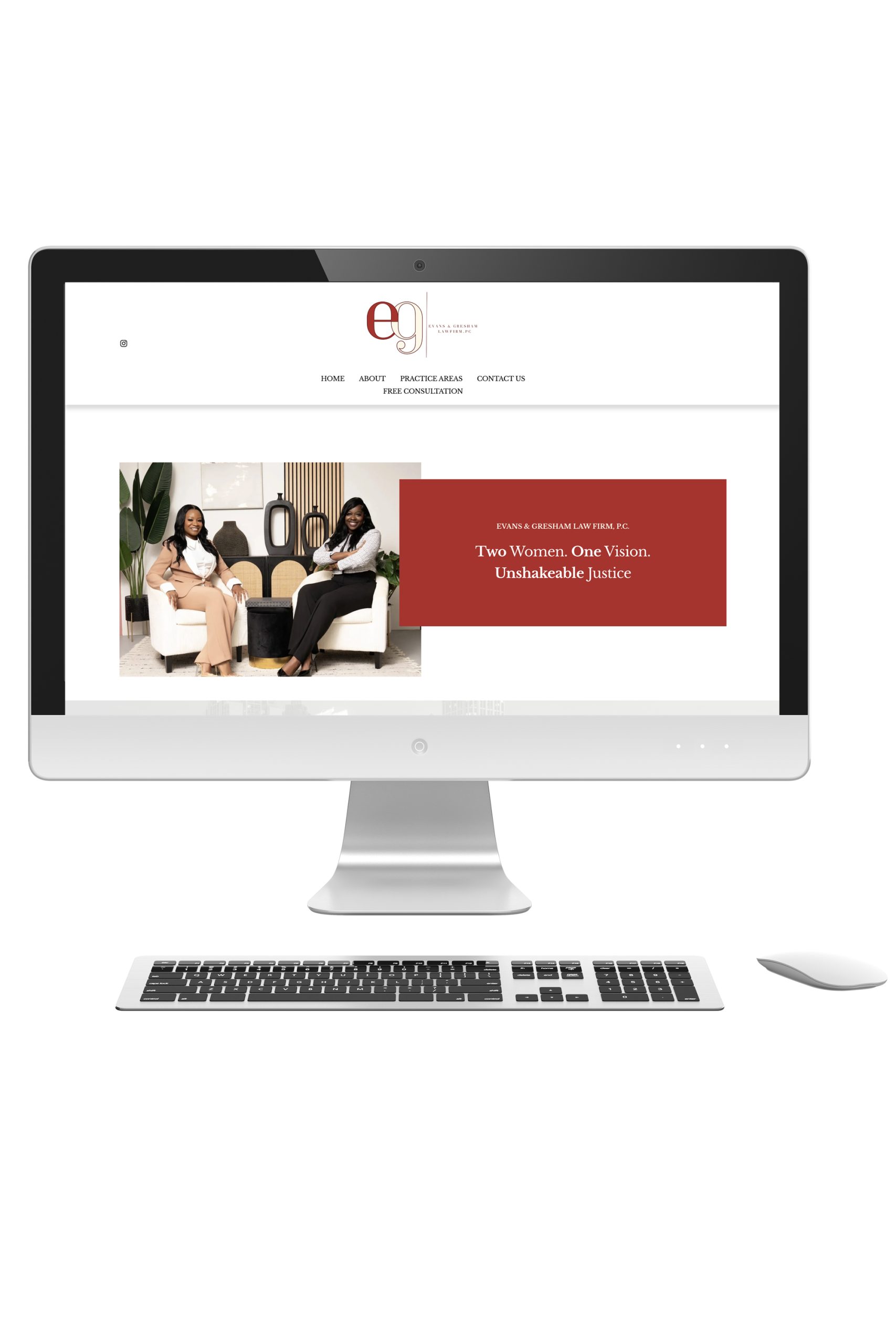
Website Design, Brand Assets, Photography & Ongoing Brand Support


Precious was a prior client as well as our go-to esthetician (we’d worked with her under her previous business name) but when she made the decision to rebrand her esthetician business around her faith, we were honored to be part of her realignment journey.

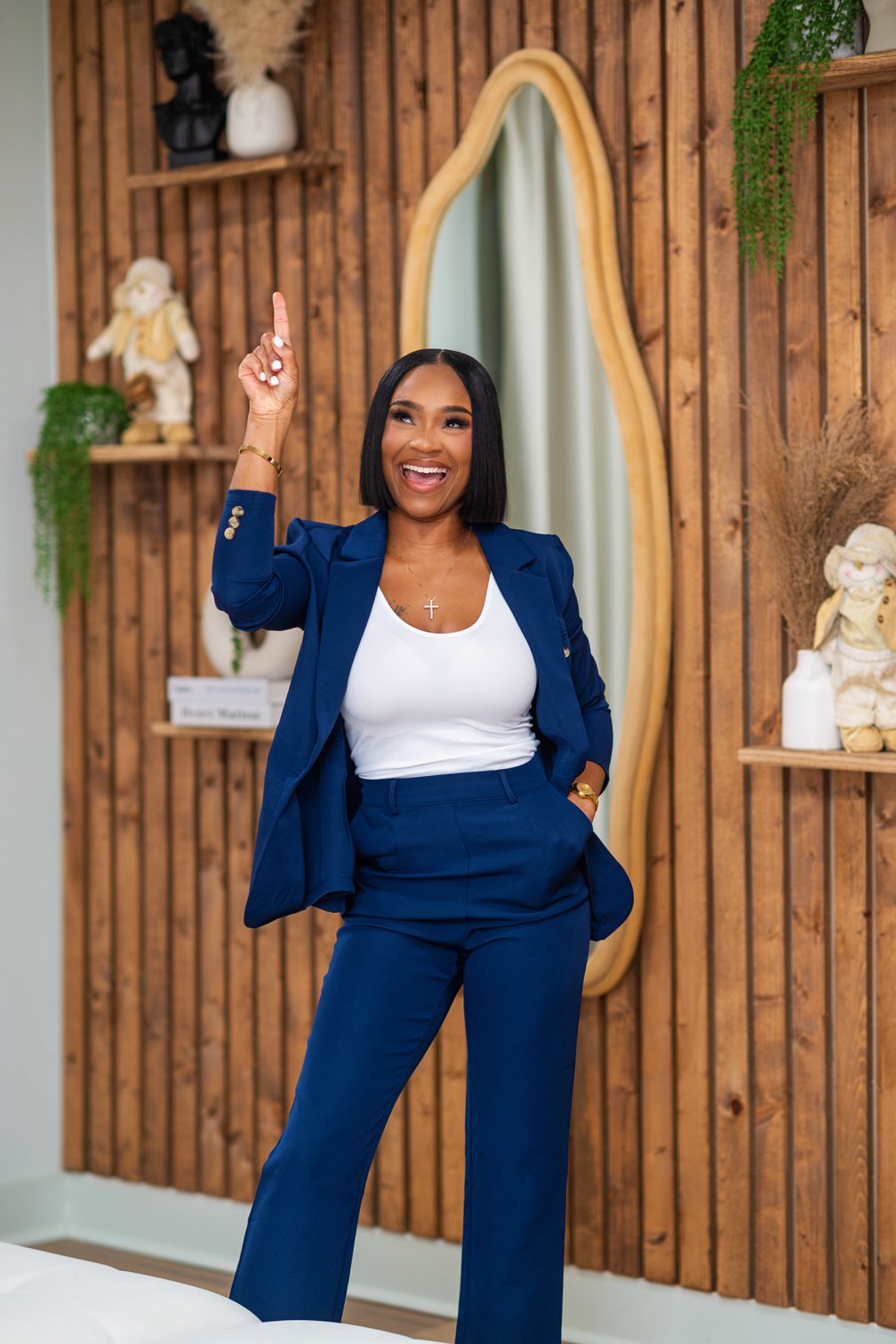
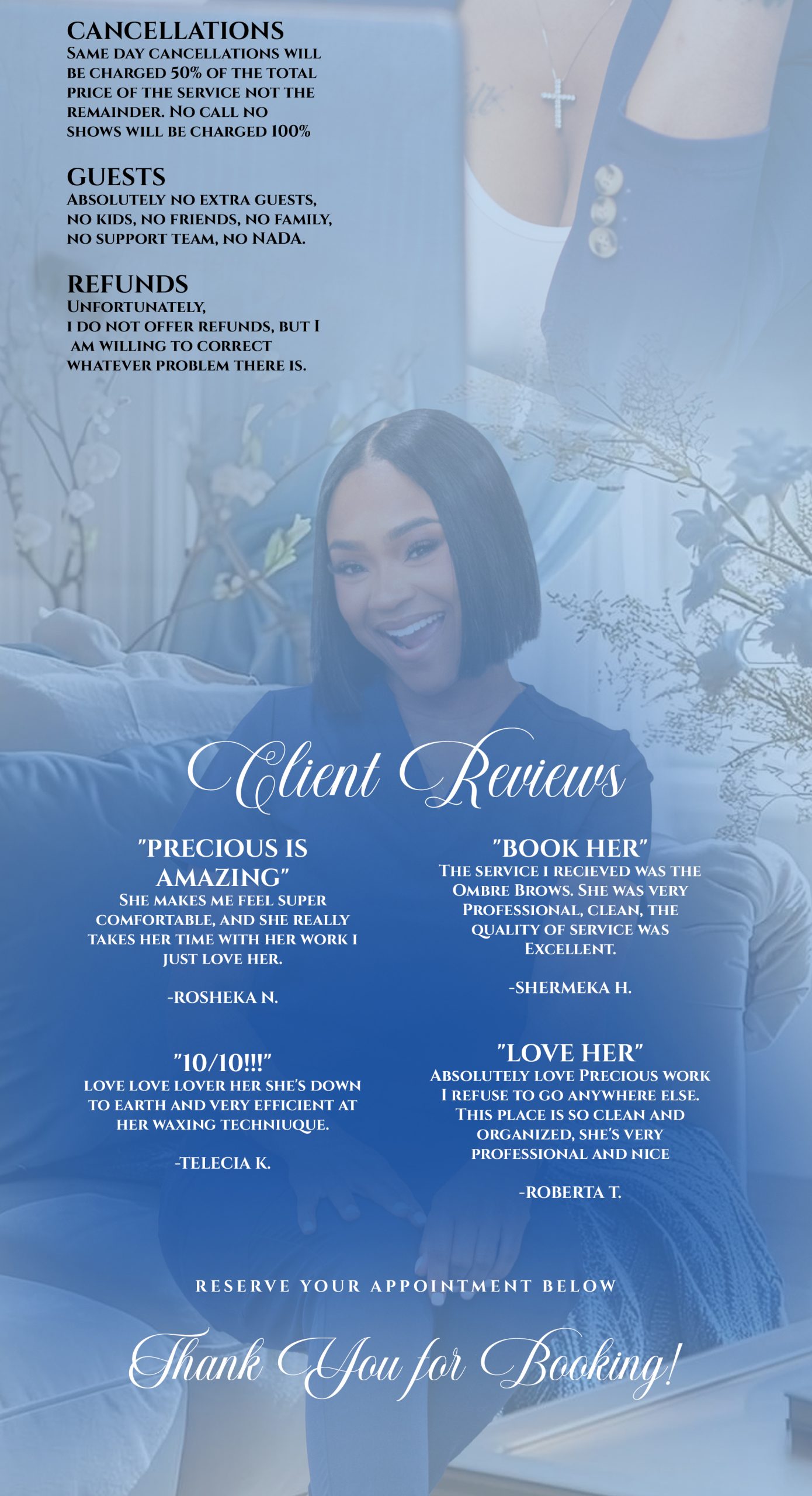
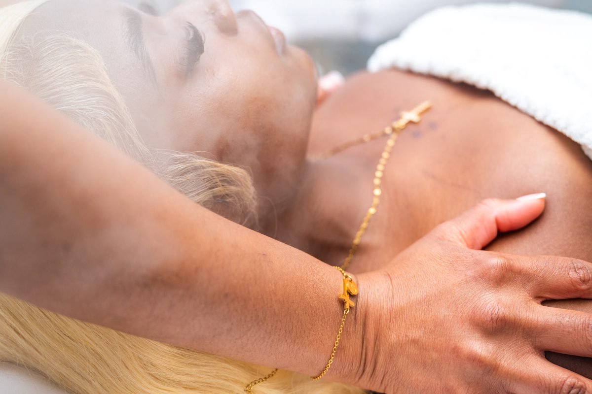
We built her first standalone website outside of Acuity, gave her Acuity booking page a full graphic revamp, created a submark to complement her existing logo, and properly vectorized her main logo so everything was clean, crisp, and ready to scale. We also curated both a lifestyle shoot and a portrait shoot to give her a complete visual library that matched the new direction.

The result was a brand that felt professional, polished, and rooted in purpose. Every element we created worked together to tell the same story, from the website down to the booking page, giving her clients a seamless and elevated experience at every visual.

And the growth? Sacred aesthetics now boasts over 4,000 social media followers, over 75 five-star reviews and she’s still climbing.  Sacred aesthetics is a business that isn’t just thriving, it’s thriving on purpose. This time, in His image.

Sacred Aesthetics

Sacred Aesthetics

Sacred Aesthetics

Sacred Aesthetics

Sacred Aesthetics

Sacred Aesthetics

Sacred Aesthetics

Fortified fitness

 Brand Identity, Website, Signage & Photography


Walt Smith came to us ready to build something necessary in Louisville, KY he just needed the right creative partner to help him shape it! Before we designed a single thing, we walked him through thorough consultations and a detailed branding questionnaire to get to the core of what Fortified Fitness was meant to feel like. That groundwork is what separates a good-looking brand from one that actually has a personality and Walt’s brand has plenty of it.

From there, we got to work on everything. We designed the full initial brand identity, built out the website, and took the vision beyond the screen by creating signage and custom wall decals that brought the brand directly into the gym space itself. Every rep or set someone does inside fortified fitness, they’re surrounded by visuals we built together. We also executed a lifestyle photoshoot to give the brand the authentic, high-energy imagery it needed to connect with its audience online and beyond.

The finished product is a fitness brand that looks and feels fortified from every angle; online, in print, and on the walls. Walt came in with a vision and left with a brand identity that’s built to last, represent his community, and grow with everything he’s working toward.

Fortified fitness

Fortified fitness

Fortified fitness

Fortified fitness